portfolio.

ready to explore?
Welcome to the place where creativity meets purpose!
Here you'll find a mix of branding, web design, product design, layout design, and illustration. Each project is a snapshot of how I bring ideas to life. Whether it's crafting a brand from scratch, designing digital experiences that click, or perfecting layouts that draw the eye, my work is all about creating imagery that resonates and stands out.
I invite you to take a dive into my design world and see how I turn ideas into something unforgettable!
For the best viewing experience, please view on desktop. Comprehensive mobile version coming soon!


branding in bloom.
blossoms kitchen & bar: brand identity
Goal: Design a modern welcoming logo for a cherry-blossom inspired restaurant concept.
Outcome: A clean, feminine logo that feels like spring in brand form.
I partnered with a client to develop the logo for Blossoms Kitchen & Bar, a new restaurant concept inspired by the elegance and renewal of D.C.’s cherry blossom season. The creative direction was rooted in striking a balance between modern minimalism and warm approachability, with a subtle feminine edge.
On the above left image, you can see my original thought process for the logo. The client ended up wanting to pursue an aesthetic that presented a little more minimalistic and sophisticated, hence the shift in design style to the image on the top right.
The final logo pairs clean typography with organic floral elements to reflect the restaurant’s inviting, elevated atmosphere. Muted tones and soft curves evoke the gentle beauty of spring blooms, while maintaining an elegant, contemporary aesthetic. The logo was designed to be seamlessly utilized across signage, menus, and digital platforms, anchoring a cohesive and memorable brand presence.
This project is ongoing so keep your eyes peeled for further updates!


driving logistics forward.


Goal: Refresh a logistics company's website to be more eye-catching, engaging, and user-friendly
Outcome: A bold, streamlined web design that delivers clarity with a creative and playful spark.
For this logistics website refresh, I aimed to bring some warmth and clarity to a typically no-nonsense industry. I leaned into utilizing the custom photography captured by Tandem Creative, pairing it with bright iconography, brand-appropriate color choices, and an overall more playful look and feel.
The goal was to make the content feel approachable and digestible, so I broke down information into bite-sized, easy-to-navigate sections, creating a user-friendly experience that still feels professional and polished.
I have included a side by side of the before and after to the right, as well as a scrollable version of the home page below.
This project is ongoing so keep your eyes peeled for further updates!
ALM website refresh


a journey from brand to brick and mortar.
wanderlust brand, proposal, & web design
Goal: Create a full visual identity, proposal, and web materials for a small, family owned souvenir shop concept at Dulles Airport in order to stand out in a competitive concessionaire pitch.
Outcome: A winning proposal. Reviewers called it a clear standout, and construction is now underway for Fall 2025.
Wanderlust began as a passion project led by a small, family-owned kiosk, Souvenir Library, at the Dulles Airport. They approached Tandem Creative with a strong, but under-developed idea for a more chic, upscale souvenir shop. With only an AI-generated logo and a vision, they asked us to help shape a brand that felt personal, natural, and visually clean. They wanted to bring something that brought s fresh energy to the cluttered trope of the average souvenir stop.
To the right, you can view my initial sketch for this project. Because sometimes you just need to badly draw a tree for the gears to start turning.

The Logo Design Process
Inspired by their desire for something grounded yet ethereal, I drew from the symbolism of the White Tree of Gondor (from Lord of the Rings,) as requested by the client. This represents resilience, peace, and rootedness. I created a few different initial variations that pair the organic tree and leaves motif with a minimalist edge.The final logo contains clean, elegant lines echoing natural forms and a small golden leaf detail signifying finding value in the small treasures we pick up along our journeys.
The client ultimately wanted to work with the round frame to complement the store's envisioned light and airy feel.
To the left you can slide back and forth to see the difference between the final logo and the original AI-generated one they started with.


The Proposal Layout
On top of the brand, we were tasked with creating a proposal that told a clear and compelling story. My role was to craft the look and feel of the proposal itself. I did this by transforming raw content and architectural plans into a cohesive, visually engaging presentation. The layout laned into the Wanderlust aesthetic: serene, neutral color palette, natural accents, and a refined look that invited to step into the world that our client dreamt up.
Above, you can see the sample template layout I created for the proposal, and below you can see the architect's rendering provided to us utilizing my design elements to pull everything together.

Wanderlust wins the Dulles Airport RFP bid!
Our design stood out immediately. When we received feedback, one of the reviewers noted they knew it was a winner the moment they opened it. The proposal was officially selected for the available retail space at Dulles and constructions is now underway. Wanderlust is set to open Fall 2025!


Website Design
Alongside the brand and store development, I created mockups for the digital experience that continue to mimic the in store energy that we are aiming for. In this context, the website is simple, light, and user-friendly. This is a base that we will continue to build off of as they collect more content and accolades over time.


The Future of Wanderlust
Wanderlust is only just beginning its journey. Like a small seed, we are hoping with time and nurturing it will grow into a steadfast tree. I hope to continue to support this growth, whether through seasonal campaigns, web maintenance, or future product development. It's so special to see the vision come from silly tree sketch to store, and I'm proud to be part of Wanderlust's evolving story.
This project is ongoing so keep your eyes peeled for further updates!

layout library.
crafting a winning proposal.
Goal: To design polished, easy-to-read proposal layouts that stand out in the competitive airport concessionaire industry.
Outcome: A distinct, professional look that elevated each proposal, many of which resulted in winning bids.
In the high-stakes world of airport concessions, standing out is everything. My role was to define the look and feel of each proposal and transform raw, often dense content into something clean, engaging, and visually compelling. From concept to layout, I crafted designs that balanced clarity with personality. Below, you’ll find a selection of layouts that helped bring these proposals to life.


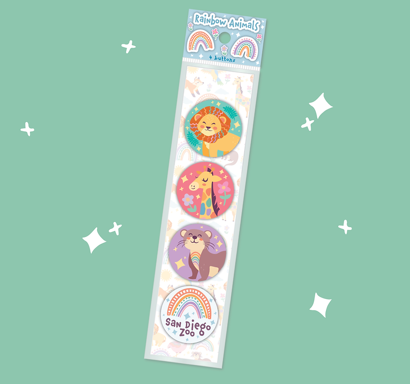
rainbow animals.
a concept to catalog collection.
Goal: Construct a playful, rainbow animal themed collection to apply to children's merchandise.
Outcome: A flexible, best-selling line with a full brand guide. Featured in catalogs and popular with zoo and aquarium clients.
This joyful, kid-forward program was my first major solo collection so I was excited to dive in headfirst. I was tasked with creating a baby and children’s product line for zoo and aquarium clients, centered around rainbow imagery. What started with a rainbow-animal theme quickly expanded to include a full cast of creatures (yes, even dinosaurs!) each thoughtfully illustrated with playful color placement and designed to work beautifully across patterns and standalone graphics.
To make the collection easy to apply across a wide range of products such as baby onesies, toddler tees, colorful pens and more, I created a comprehensive brand guide. This included everything from fonts and color palettes to patterns and assets, making it easier for fellow artists to drop the designs onto products, and for sales teams to pitch the program with confidence and all the information at their fingertips.
The guide also served as a visual menu for customers, who could mix and match their favorite animals or use ready-made designs. The Rainbow Animals collection went on to be featured in multiple catalogs, including a spotlight in the sticker catalog, which helped it gain extra popularity at trade shows and sales events.


hand-drawn stories in souvenir form.
my sketchbook collection.
Goal: Create a bold, locally inspired souvenir collection that feels fresh, personal, and punchy.
Outcome: A hand illustrated, vibrant product line that became a hit at national trade shows and sparked a series of custom collections for clients across the country. It was featured on mugs, glassware, apparel, and more!
During my time at Charles Products, the Sketchbook series quickly became one of the most meaningful and impactful programs I had the pleasure of leading. It all began when White House Gifts requested a DC-themed collection. As a proud local to the DMV, I jumped at the chance to create something personal and bold.
Inspired by the charm of Starbucks’ location mugs, I envisioned a vibrant collage of local icons, but with my own hand-drawn illustrations, unique color palette, and a more playful, expressive style.
Each piece started in my sketchbook, where I carefully researched the region, illustrated every element by hand, and then brought the artwork to life digitally in Illustrator.
The result? A beloved product line that was showcased at souvenir trade shows across the country and led to custom Sketchbook collections for a range of clients. These adaptable designs lived on everything from mugs and tumblers to water bottles, pint glasses, and stickers.
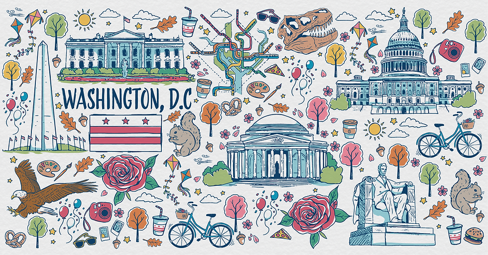
Created for White House Gifts

Created for the Newport Mansions

Created for Peak Concepts
Created for White House Gifts


still curious? here's a few more for the road.
Swipe through a few bonus projects that didn't quite fit the lineup, but still deserve their moment in the spotlight. These extra projects show a broader peek into my design work, from past faves to quirky one-offs. Feel free to browse to your heart's content!


